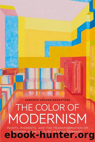
The Color of Modernism by Deborah Ascher Barnstone;

Author:Deborah Ascher Barnstone;
Language: eng
Format: epub
Publisher: Bloomsbury UK
Hinnerk Scheper and Walter Gropius
One of the most interesting collaborations on color and spatial perception was between Hinnerk Scheper and Walter Gropius.34 Gropius is well-known as an architect and as the first director of the Bauhaus; Scheper is a far less celebrated figureâhe was a former student at the Bauhaus and, later, a Master of the Wall Painting Workshop. Born Gerhard Hermann Heinrich Dühne, from 1921 he adopted the last name of his adoptive father and the Low German version of Heinrich, Hinnerk. He matriculated at the Bauhaus at the start in 1919, where he elected to study in the workshop for decorative wall painting. Scheper had already completed the journeymanâs course with master painter Gustav Nehmelmann in Badbergen in northeast Germany, and had worked for another master painter, Rudolf Engels, in Quakenbrück, a nearby town, and was therefore already quite an accomplished interior painter when he arrived in Weimar.35 He completed his studies at the Bauhaus in 1922 after which he began a career as a color designer rather than a painterâan interesting choice of professional title. Clearly, his extensive work with three Bauhaus teachers, Johannes Itten, Oskar Schlemmer, and Wassily Kandinsky, who were passionately interested in color, had had an effect on the young man.
According to Lou Scheper, Hinnerkâs wife, who was also a Bauhaus-trained artist, her husband developed the principle of âcolor in architecture as a design element of the building, not a superimposed end effect.â36 By this he meant that color had to be considered as an integral part of any design from its inception. Scheperâs early work was influenced by Johannes Ittenâs mystical approach to design, but, by 1924, Scheper had fully accepted the turn towards functional planning. âColor was assigned the task of self-presentation of the architecture, it had to serve the purpose of the room at the same time. The difference between load-bearing and infill elements provided the possibility of strong tensions in the light/dark contrasts and material oppositions.â37 In other words, color was now used to enhance the architectural design and spatial effects of the architectonic elements.
Scheperâs first commission, which he obtained soon after completing his studies in 1922, was for the Landes- und Schlossmuseum (State and Castle Museum) in Weimar. The director of the museum, Wilhelm Köhler, approached Scheper to devise an interior color scheme as part of a project to renew the exhibition design.38 Surviving sketches for the project evidence his early interest in using color to differentiate architectural elements in the space and to affect spatial perception. In his view, the ceilings of the Neo-Renaissance building were proportionally too high, which he attempted to use color to correct. In one sketch, the walls are indicated in white, space between the hanging wall and crown molding is gray-blue, the decorative crown molding is deep red, and a band of molding at the baseboard and door frame is black and gray. By using a darker color above the bright white, Scheper would have created the illusion of a heavy, lower ceiling over an expanding space below.
Download
This site does not store any files on its server. We only index and link to content provided by other sites. Please contact the content providers to delete copyright contents if any and email us, we'll remove relevant links or contents immediately.
Wonder by R.J. Palacio(8253)
Unlabel: Selling You Without Selling Out by Marc Ecko(3459)
Mastering Adobe Animate 2023 - Third Edition by Joseph Labrecque(3328)
Ogilvy on Advertising by David Ogilvy(3312)
Hidden Persuasion: 33 psychological influence techniques in advertising by Marc Andrews & Matthijs van Leeuwen & Rick van Baaren(3283)
Drawing Cutting Edge Anatomy by Christopher Hart(3273)
POP by Steven Heller(3222)
The Pixar Touch by David A. Price(3195)
The Code Book by Simon Singh(2841)
The Art of War Visualized by Jessica Hagy(2826)
The Curated Closet by Anuschka Rees(2791)
Slugfest by Reed Tucker(2783)
Rapid Viz: A New Method for the Rapid Visualization of Ideas by Kurt Hanks & Larry Belliston(2719)
Stacked Decks by The Rotenberg Collection(2673)
The Wardrobe Wakeup by Lois Joy Johnson(2625)
365 Days of Wonder by R.J. Palacio(2613)
Keep Going by Austin Kleon(2589)
Tell Me More by Kelly Corrigan(2511)
Tattoo Art by Doralba Picerno(2480)
